Warsteiner
Herb


Warsteiner
Tart and Handy
Design, Trends
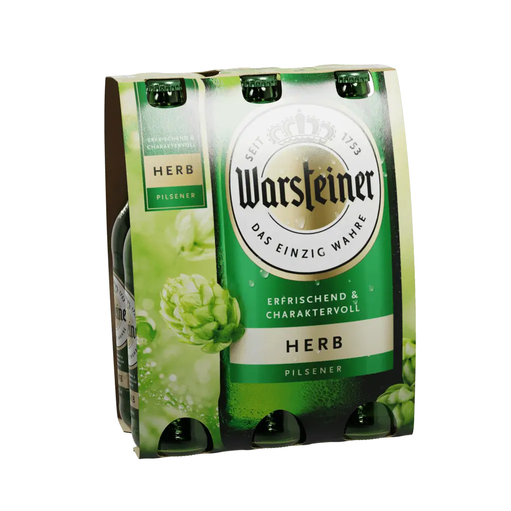
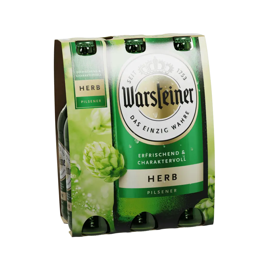
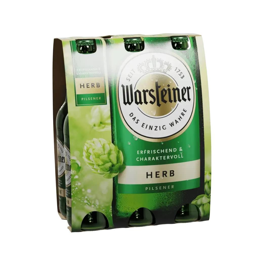
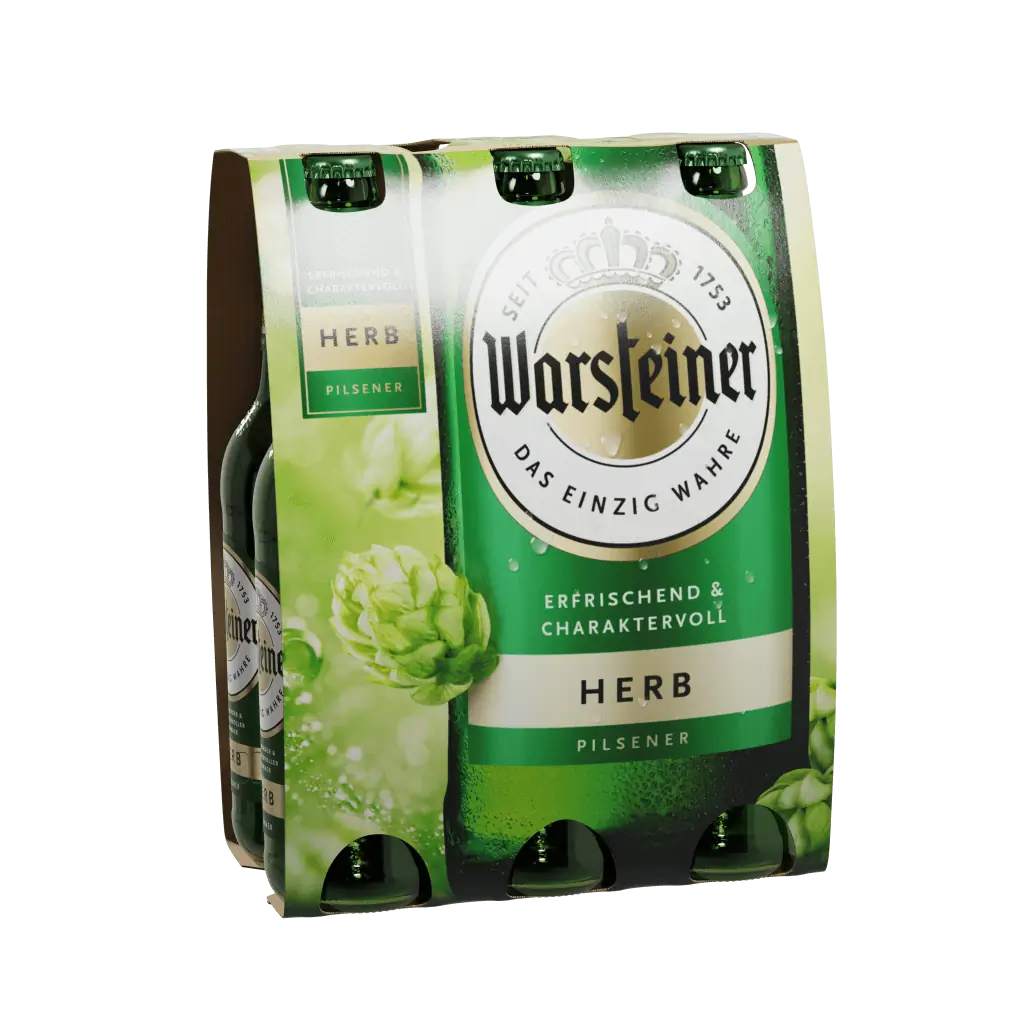
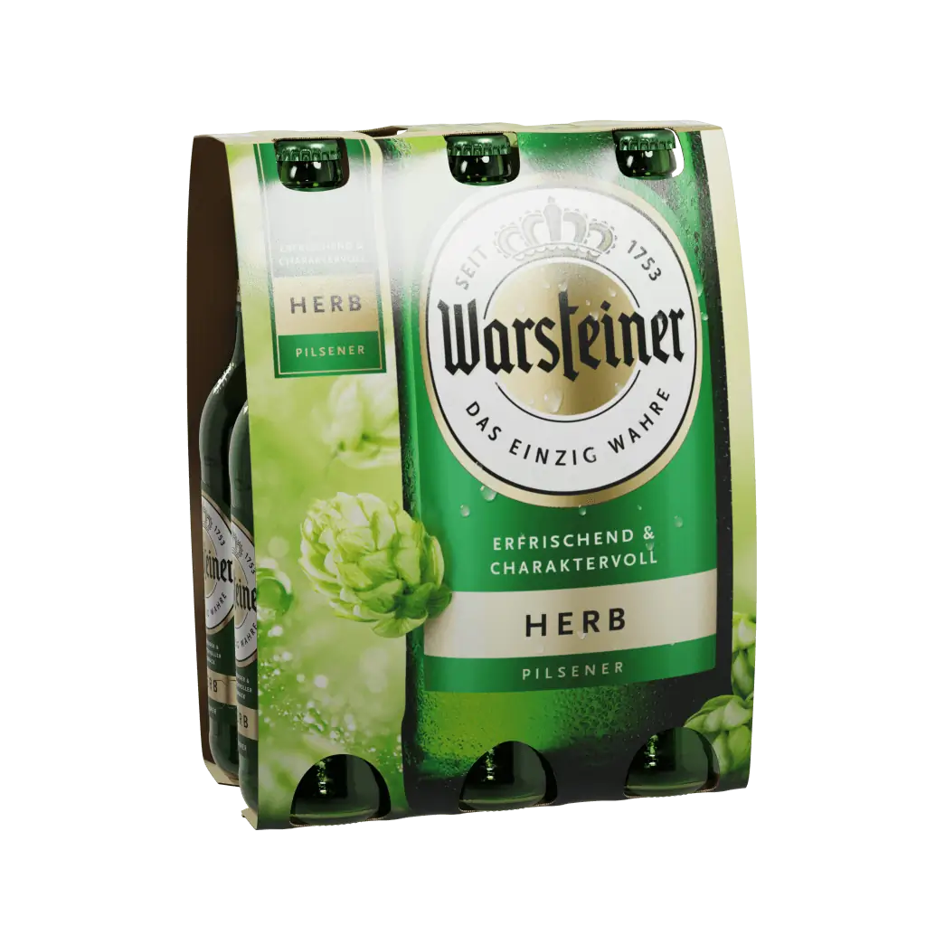
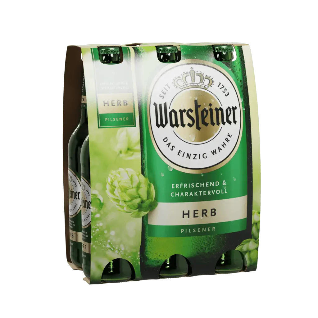
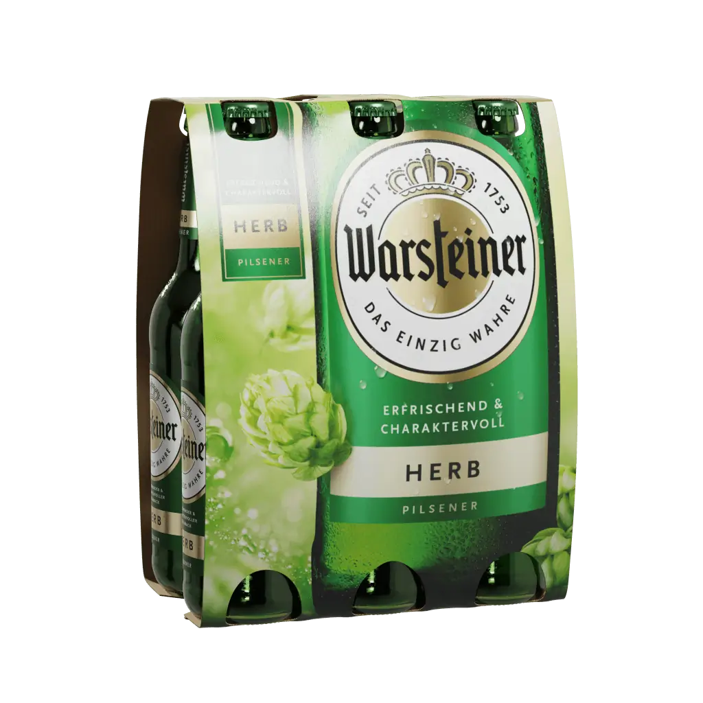
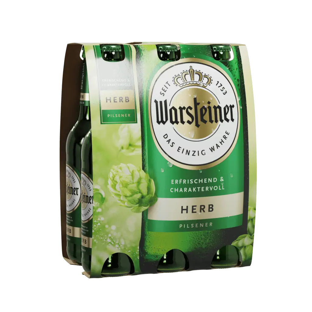
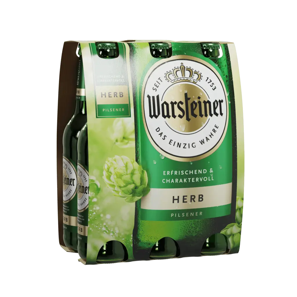
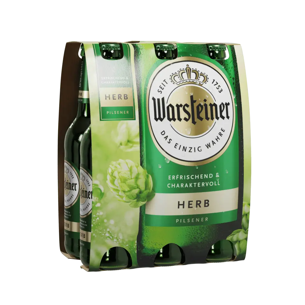
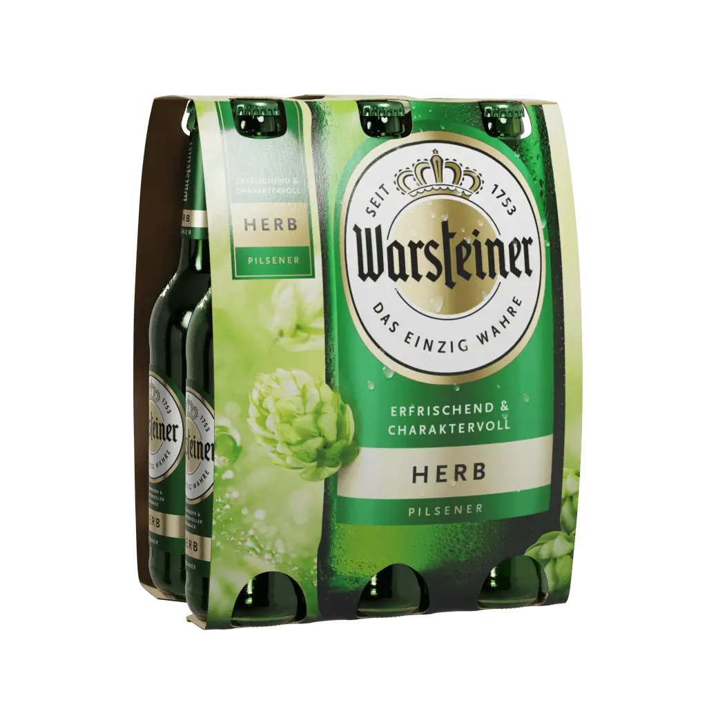
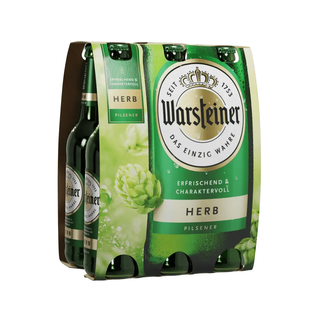
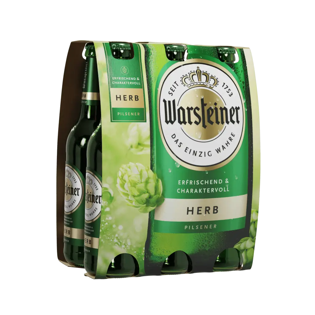
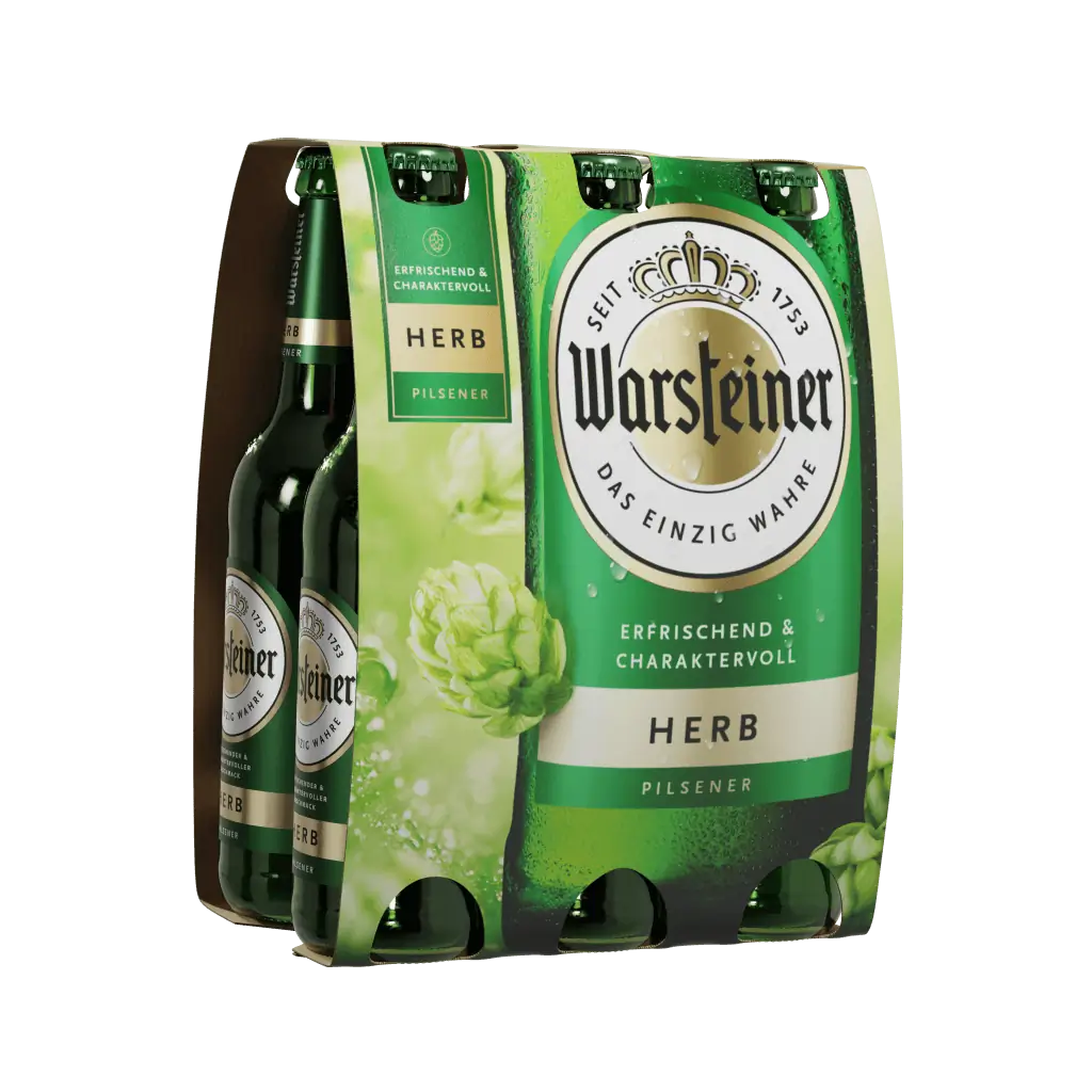
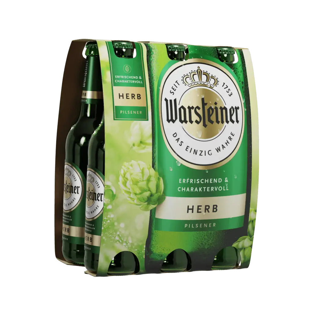
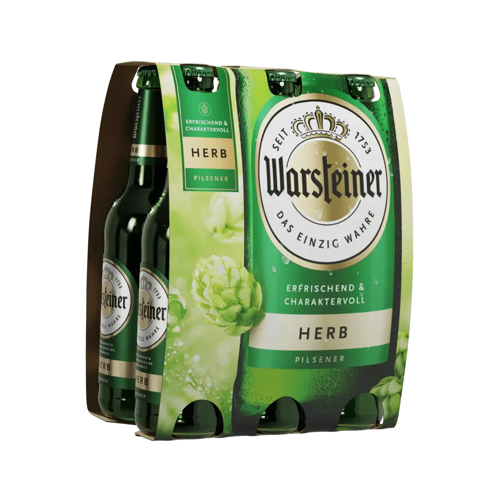
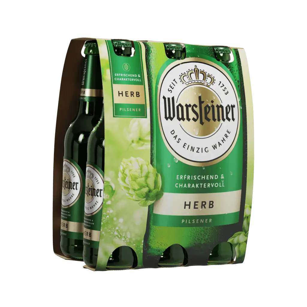
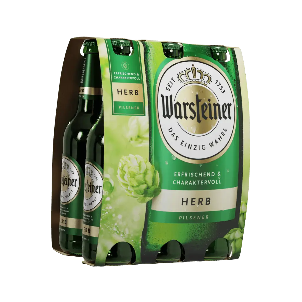
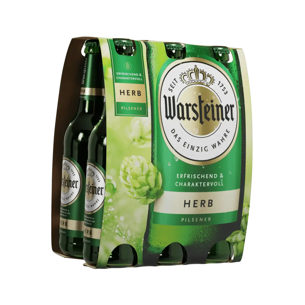
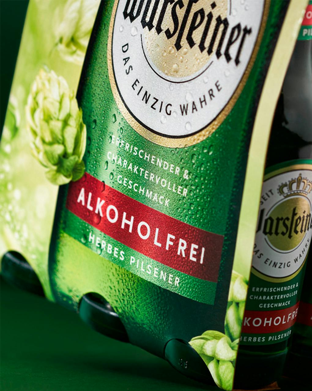
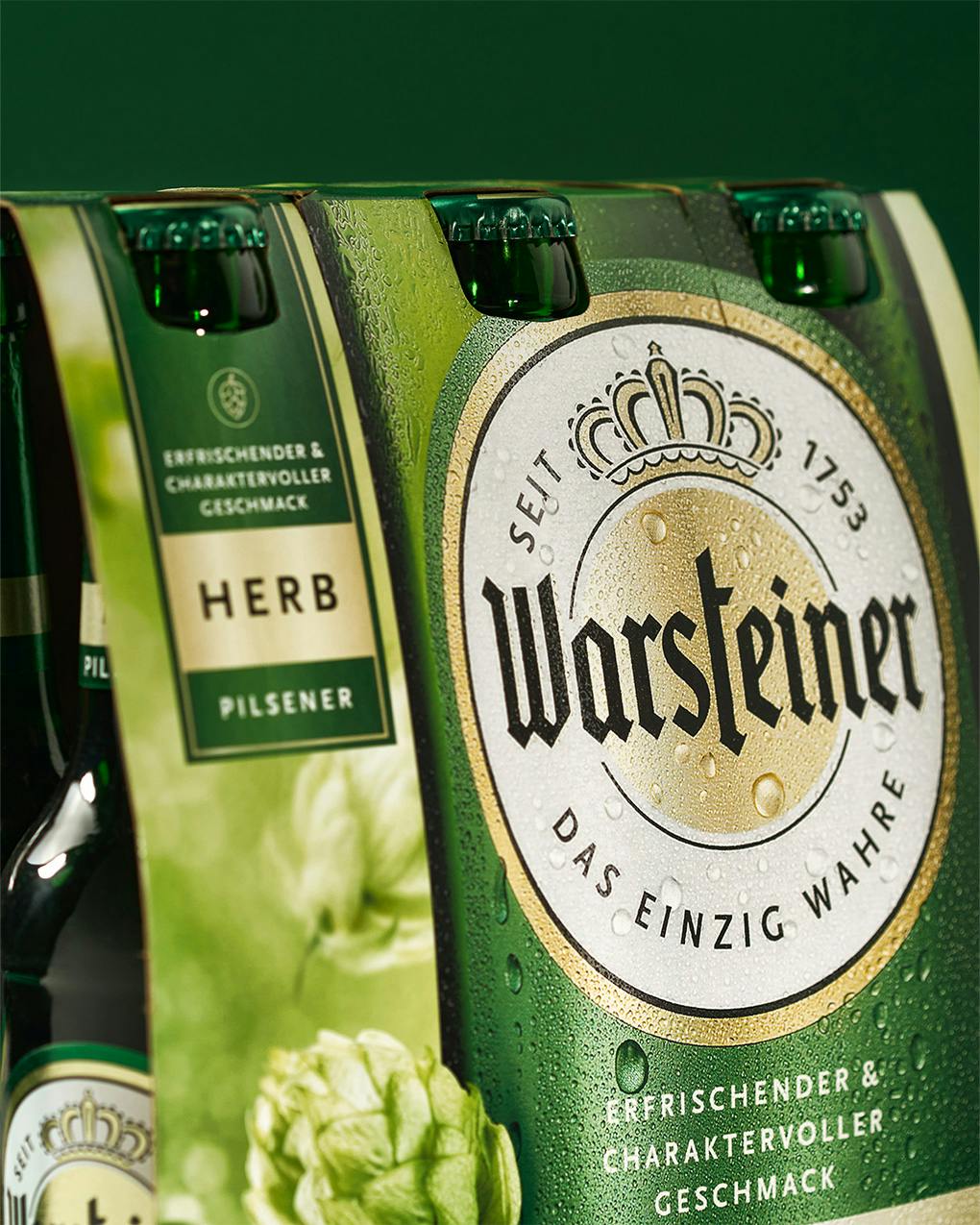
Our packaging design for the relaunch of Warsteiner Herb and its six-pack had to be authentic, natural, and yet eye-catching. And, of course, make people want to drink beer.
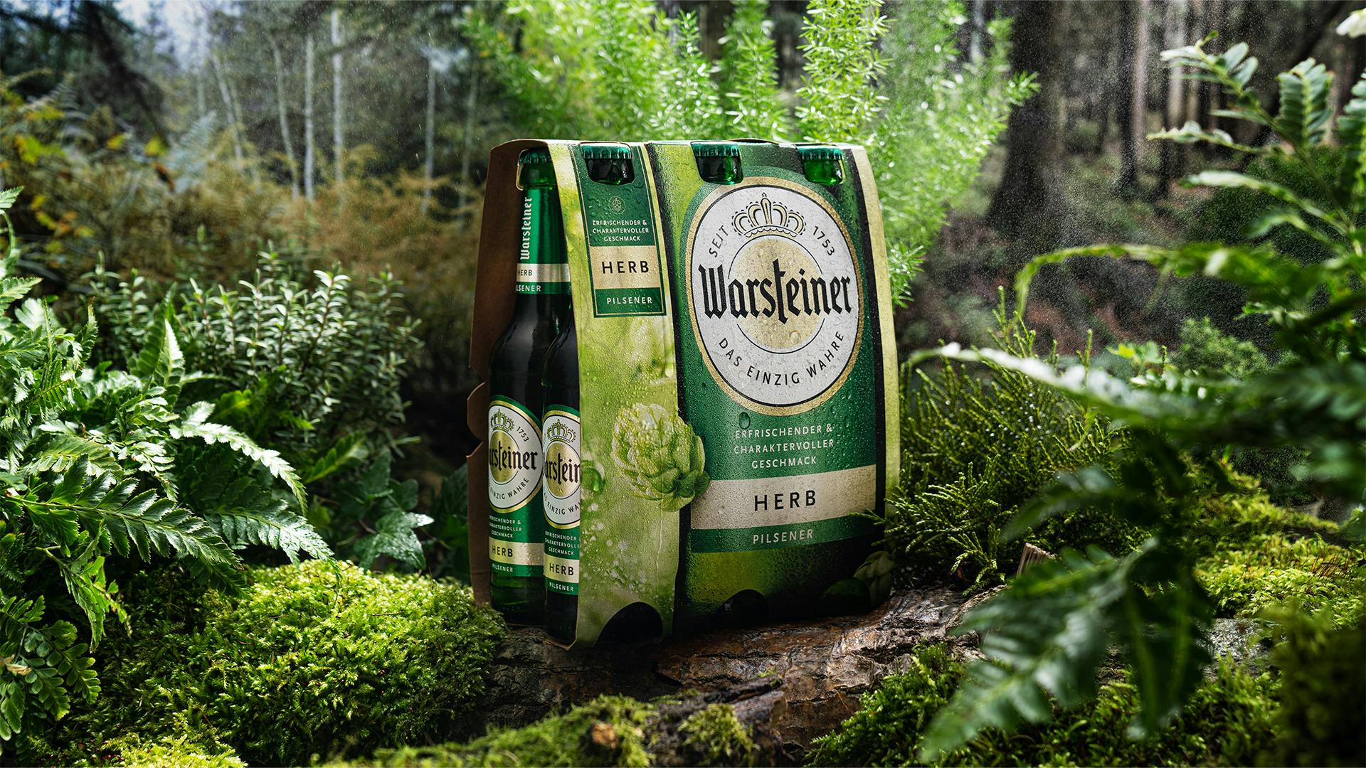
After the relaunch of the “classic beer range,” long-term customer Warsteiner commissioned us to give the Warsteiner Herb and six-packs a new look. Our challenge: to design something that honored the cold-hopped, natural brew and bring some fresh air to the shelves.
Working closely with Warsteiner, we came up with a design language that goes full throttle for flavor – while still respecting the very traditional looks of the beer segment.
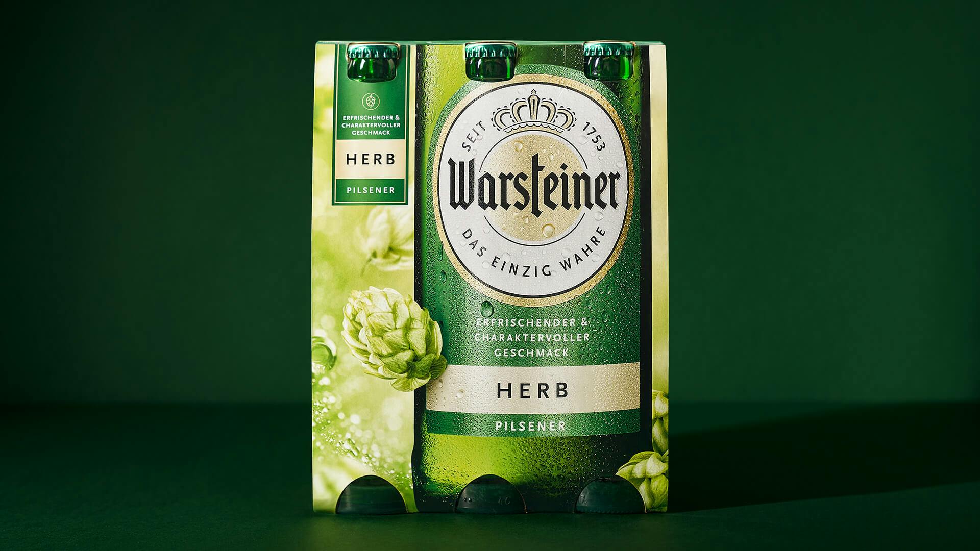
Tone on tone: the different shades of green in the bottle, label color, and hops create a visual haven of calm and give the cold-pressed Warsteiner Herb a grounded look and feel. The dominant, deep green tones stand for genuine closeness to nature and put the hops in the spotlight.
Related cases

Borussia Brauerei
Borussia Brauerei

Trojka
DIWISA

ESCAPE RUM
DIWISA

Modjo
Creative Concept

KaDeWe
Creative Concept

Champagne Pommery
Vranken-Pommery

Throwback
Creative Concept

Flow
Creative Concept

EVERMANN
Bimmerle

Warsteiner Festivals
Warsteiner

Cognac 24 Ans
Creative Concept

Warsteiner Herb
Warsteiner
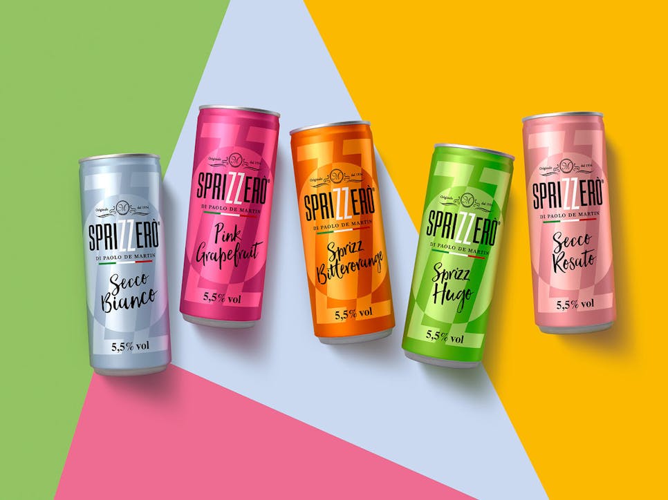
Sprizzerò
Sprizzerò by De Martin

Warsteiner Bierlikör
Warsteiner
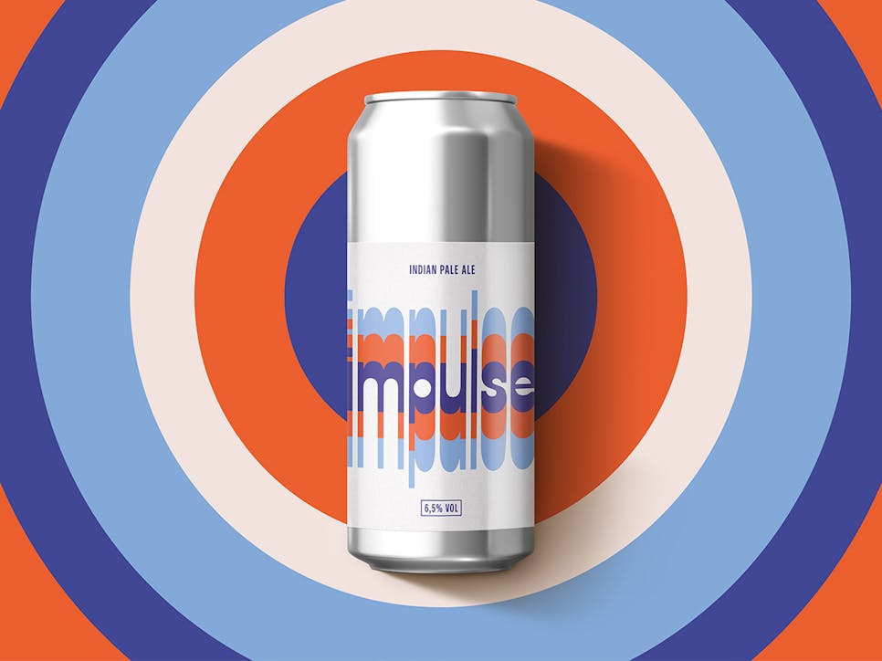
Impulse
Creative Concept
Get in Touch
Our 25 years of expertise are just a phone call away.
