SYS

Babor
Superfood for Super Skin
Design, Strategy, Trends
When the skincare market is hungry for more, it was time to whet their appetite with SYS: Superfood 4 Your Skin.
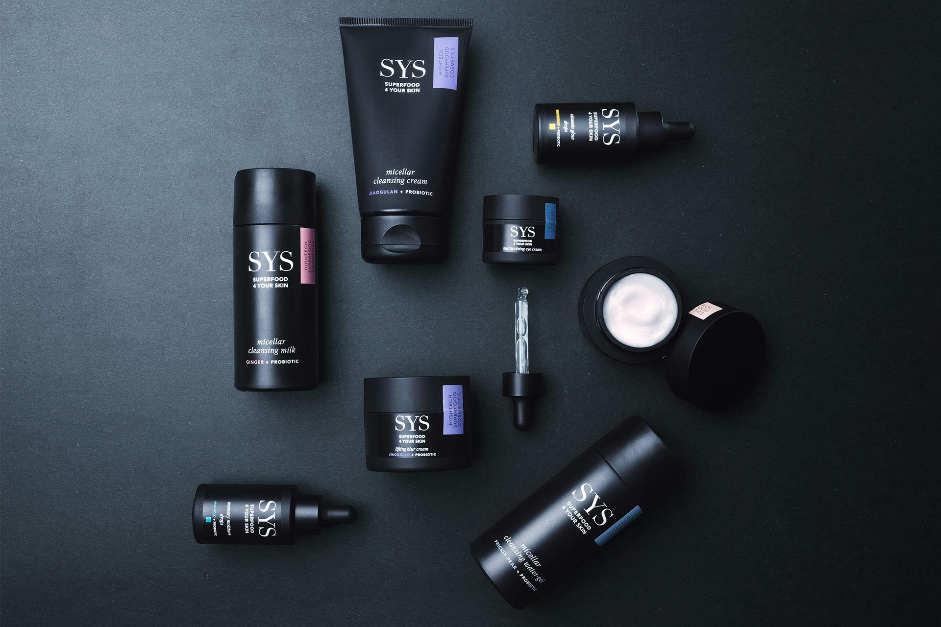
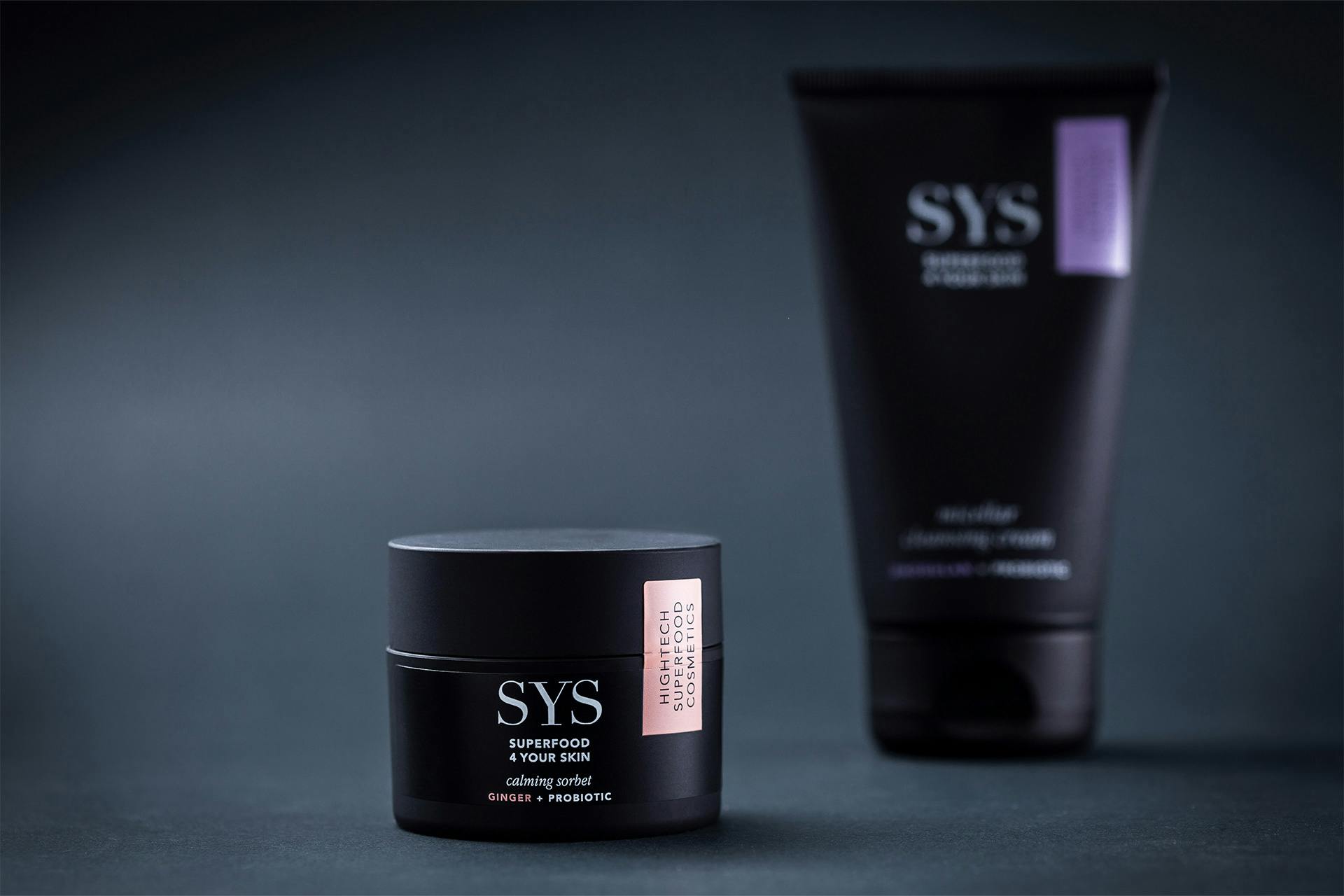
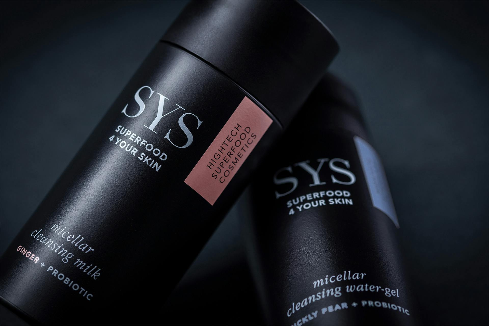
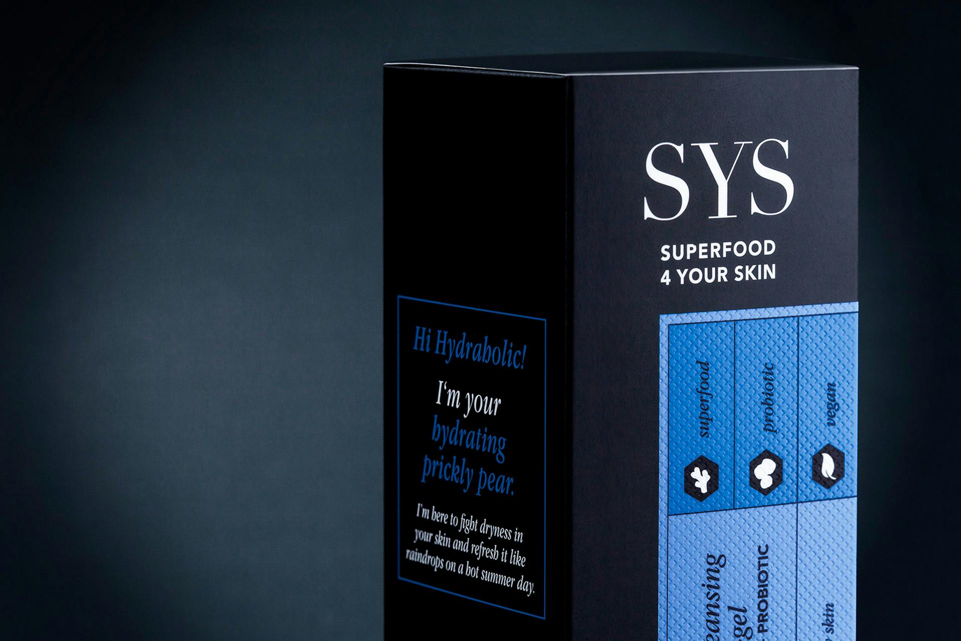
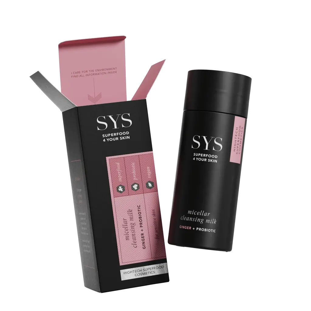
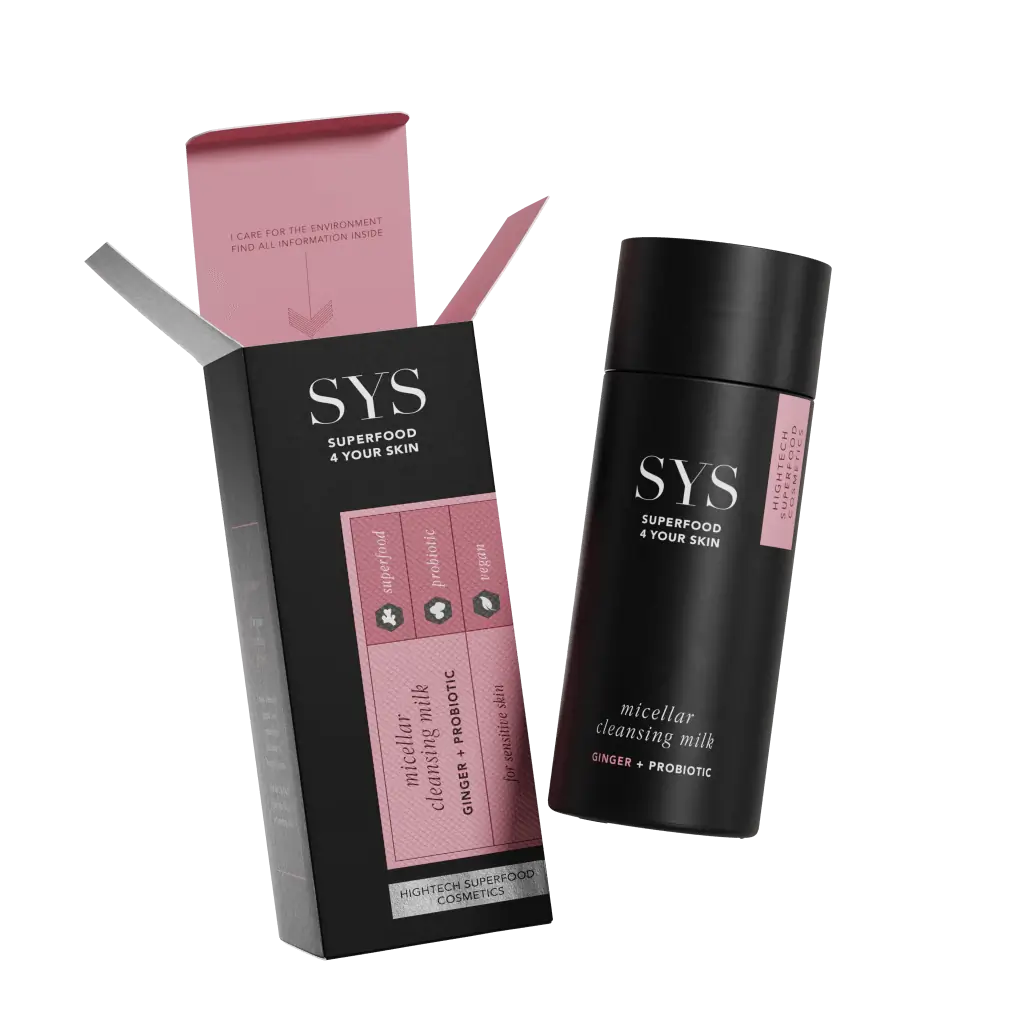
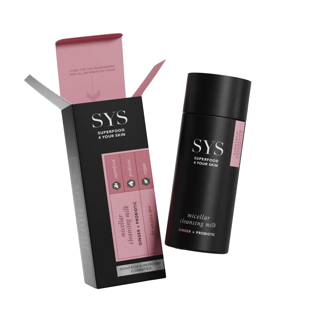
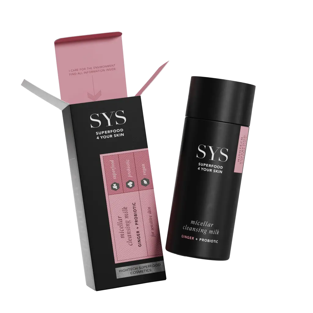
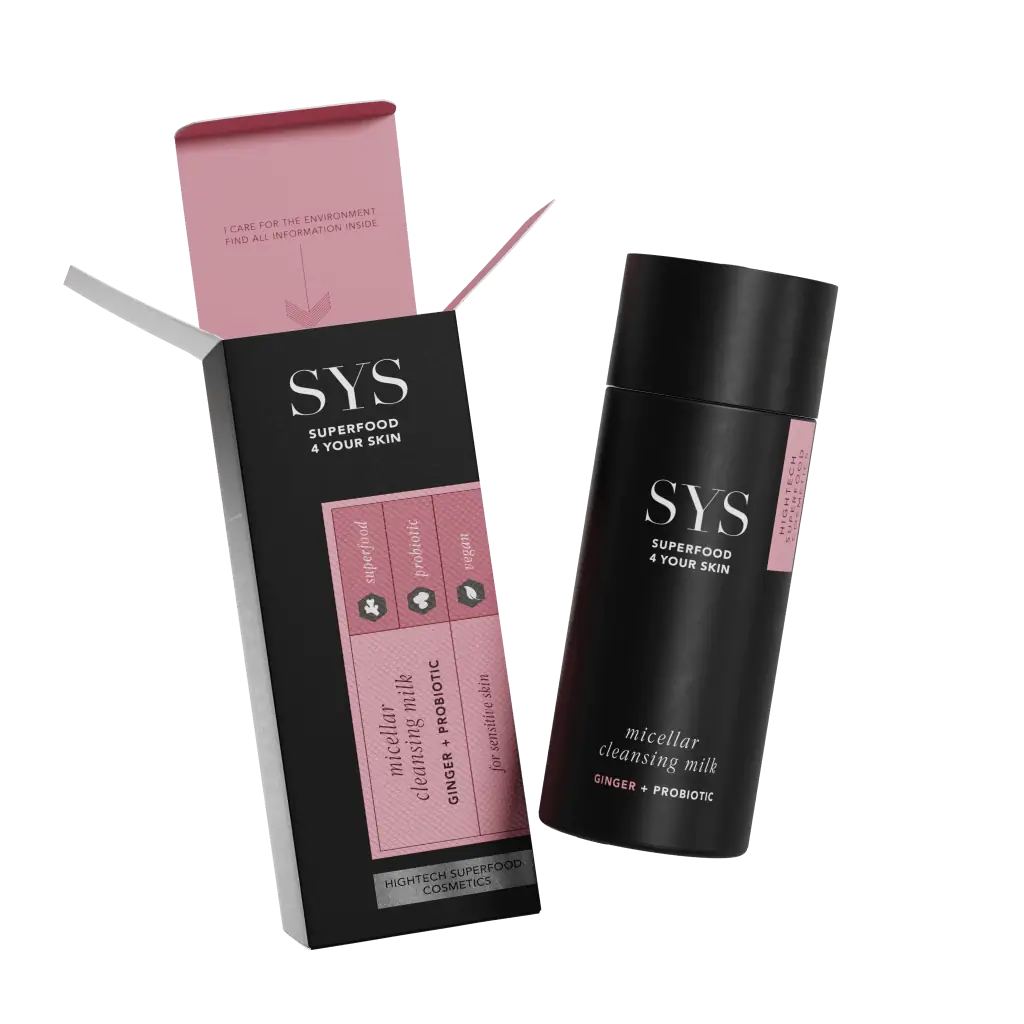
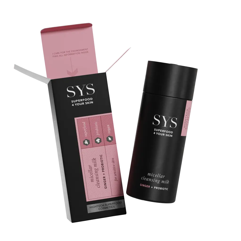
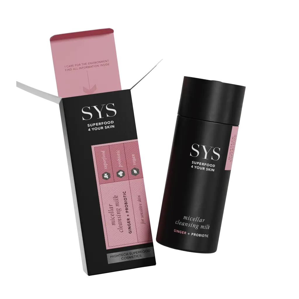
Innovative professional formulas make SYS a customized skincare solution – and a new generation of skincare that deserved a groundbreaking, sustainable packaging design. The mix-and-match concept of the products is pragmatic and functional, which we also wanted to convey with the packaging design.
As Babor’s first skincare line to be sold over-the-counter at Douglas & Co, SYS gave us total freedom to move beyond the classic Babor design language.
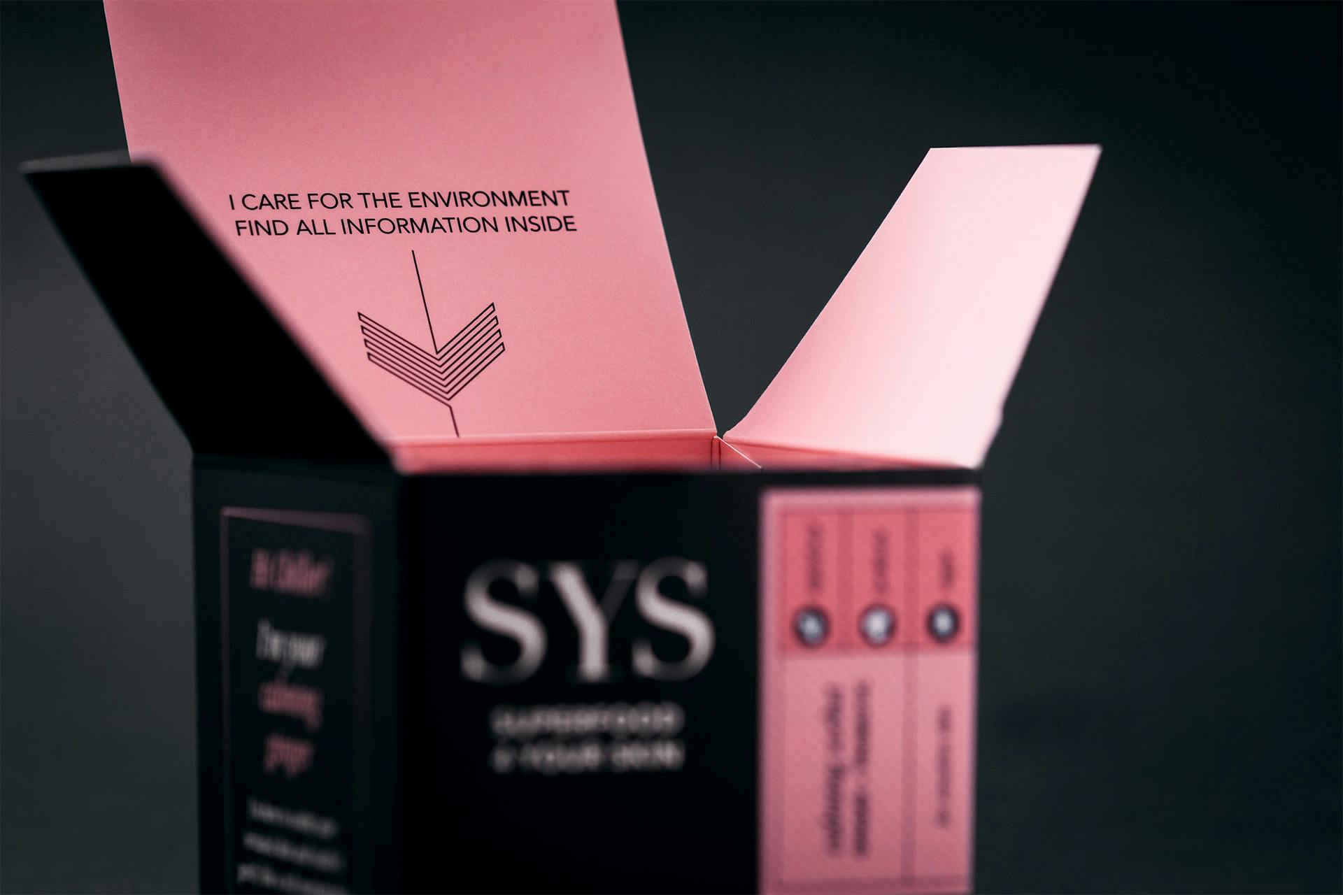
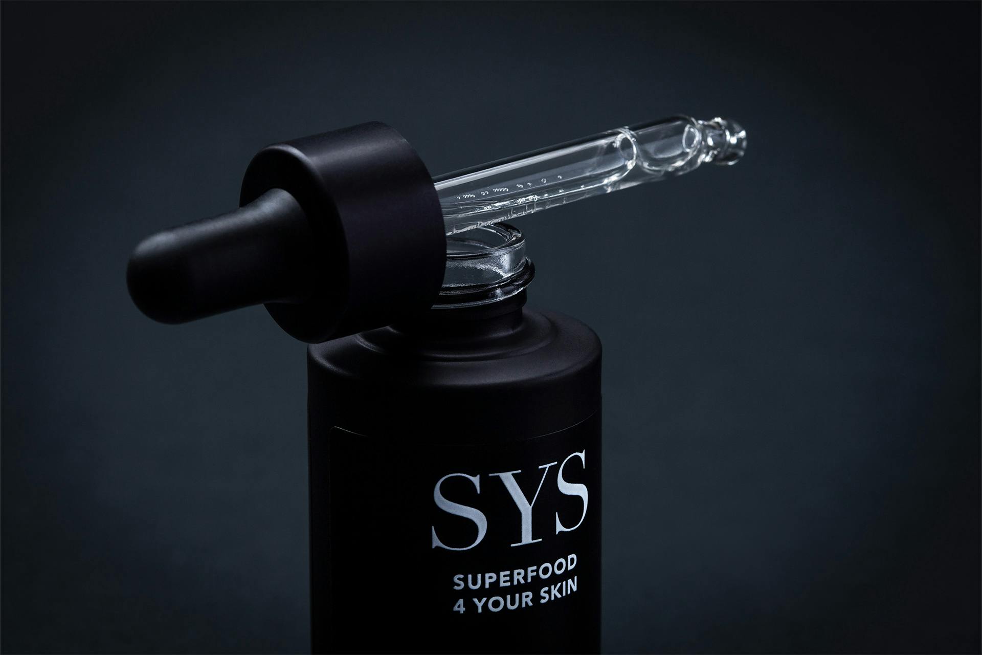
Strong, high-quality, and extremely effective, the design of SYS is intended to visually communicate what it does. Inspired by the colors of superfood extracts, a clean aesthetic is used in combination with deep black, which is primarily intended to appeal to a modern target group. To strengthen the standalone character of the brand, the benefits of the series are the focus – and give the packaging a certain coolness factor with a self-confident understatement.
